My monthly round-up of interesting design that I've come across in the past month. If you missed the May post, it's right here. Prospectus Typeface Last month, the Lost Type Co-op released a really interesting serif face titled Prospectus. If you just look at the heavy weight, it looks like …
I thought I'd try a series collecting some things that I found interesting in the previous month. They might be design, art, articles, words…whatever causes me to pause and dig deeper. Robert Dawson's Library series I've always loved libraries, and have since childhood had access to really great libraries and …
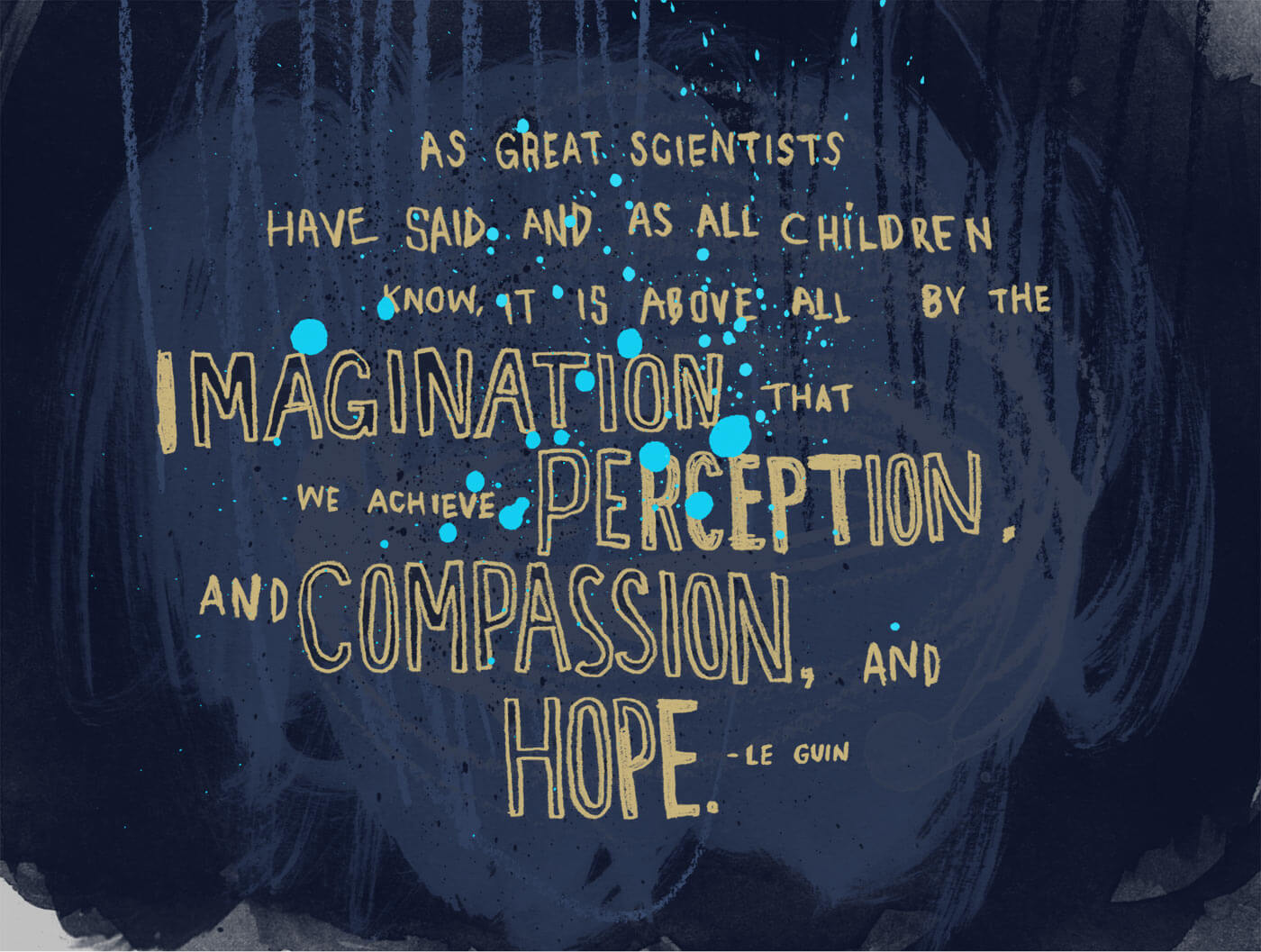
I've been thinking about the death of Ursula K. Le Guin and her affect on me. I discovered her books—specifically The Wizard of Earthsea—at a relatively young age. What age exactly I don’t quite recall, but certainly in that formative period of between 10 and 12 years old. While at …
Look, I know what you're saying. No, you don't need another top 10 list. And yes, I am pretty late in getting this thing out the door. Here's the thing though: I do this mostly for me. It's really fun to look back at the music that I really enjoyed …
Not unlike 2015, 2016 was a pretty fantastic year for music. A lot of people seem to agree with me so I don't think that it's specific to my small musical sphere. As I like to do every year, here's a quick rundown on my favorite music from the last …

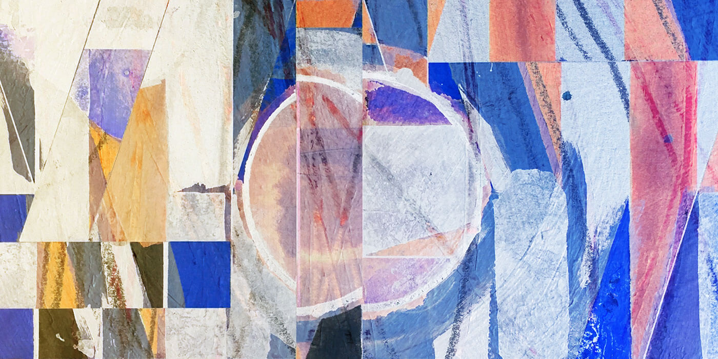
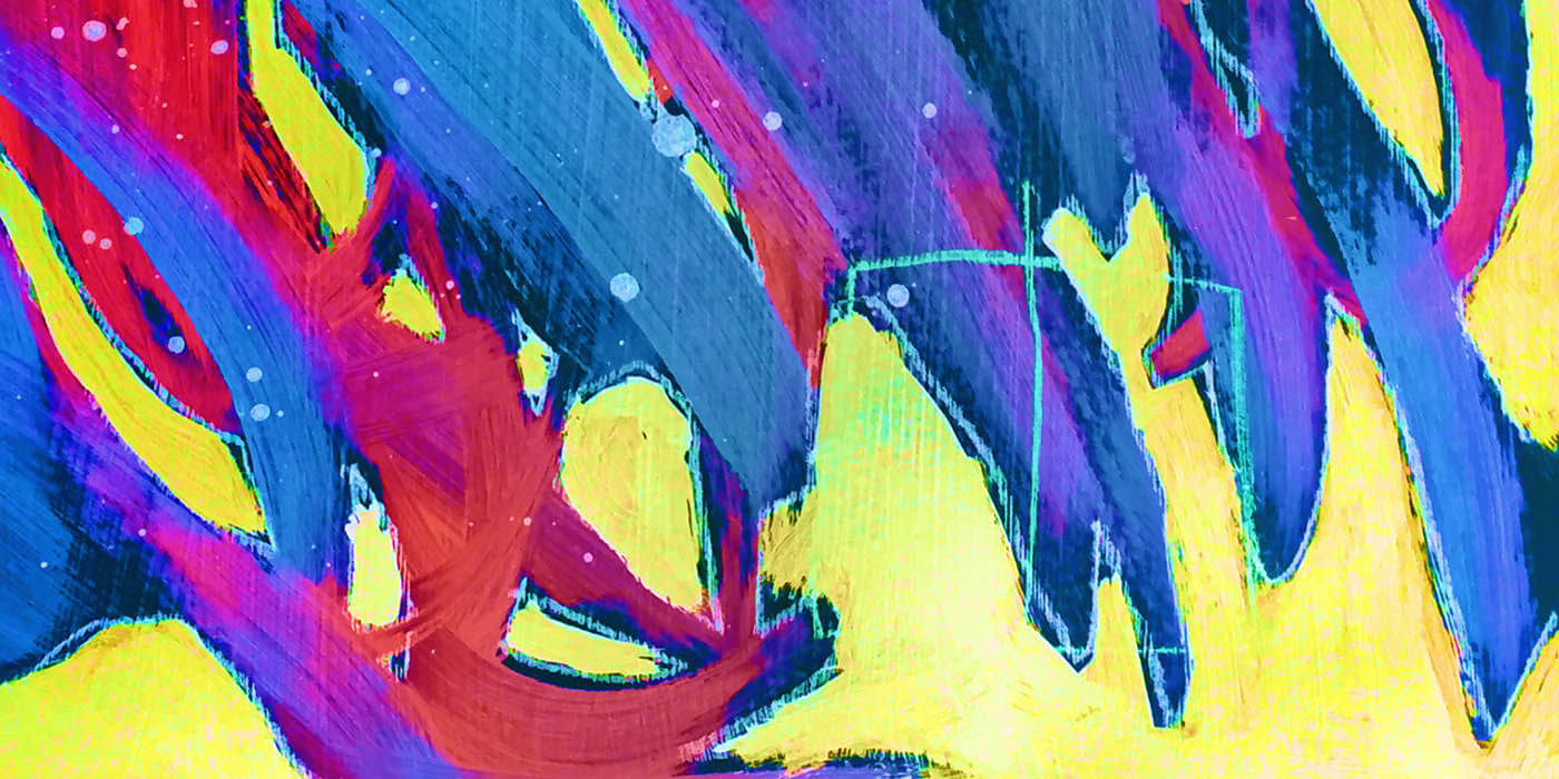
I took a dive into Processing this year. It started with going through Josh Davis's intro class on Skillshare, and then moved on to Dan Shiffman's intro book. While the dive was fairly shallow, I really liked getting into it and I'm hoping to get back to it sometime soon. …
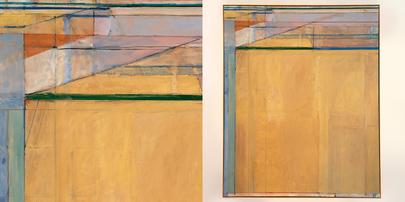
I've been looking at the work of Richard Diebenkorn a lot recently. With his unique structuring of space and sun-seeped color palettes, I'm drawn deeply into his world of abstraction. The work resonates deeply with both the work that I do professionally as well as my more artistic practice. It's …
The common wisdom is that once something is on the Internet, it lives forever. There is certainly some truth to this idea, especially for memes that become widely spread. After all, if nothing else, the Internet is extremely good at enabling the distribution of information. Once an idea moves beyond …
As designers mature there is a natural tendency to shift focus from end products to the act of design itself. Indeed, we're seeing a period of maturation of the profession as the discipline of user experience continues to develop and expand. In some sense we can look at our careers …
I've been thinking about a phrase that I hear quite frequently: "work-life balance." The phrase comes up most often when people are taxed beyond their abilities by their job and looking to gain some amount of reprieve from the constant demand of work pressures. While some are on a mission …