
My monthly round-up of interesting design that I've come across in the past month. If you missed the May post, it's right here.
Prospectus Typeface
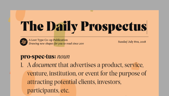
Last month, the Lost Type Co-op released a really interesting serif face titled Prospectus. If you just look at the heavy weight, it looks like another take on the high-contrast serif faces that have become quite fashionable of late. I'd encourage you to look at the full set of weights and styles, especially the lighter weights an italic styles. It's a really unique face, with a very nice microsite art directed by Riley Cran.
The Guardian: Consumerism vs. Materialism
"If we want to cure affluenza, we have to get more satisfaction from the things we already own, more satisfaction from services, more satisfaction from leisure time, and less satisfaction from the process of buying new things."
While not explicitly about design, it's hard not to think about the implications of our consumer lifestyles without considering the part that design has to play. I'm just as guilty of purchasing things for that immediate rush, but I've really become frustrated lately how expensive or just difficult impossible it is to repair so many of the electronics that I've acquired over the years. At the very least, it's a reminder to appreciate the things that we have.
A Shift in the Design for Politics
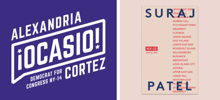
As much as our current political climate feels like a dumpster fire, it's nice to see that some progressives are embracing modern branding as a tactic to engage with a younger voting populace. The recent success of NY Congressional candidate Alexandria Ocasio-Cortez has been really inspiring to watch, and I hope it signals a change in our national political discourse. In addition to the work for Ocasio-Cortez, the campaign of Suraj Patel also caught my eye.
I hope you found some of this inspiring, and check back new month for more.
No Comments.