
It's been a long winter. I've had some personal stuff going on, and life has been pretty full with things that aren't necessarily writing. As a result, I've let the posts slip on this site. This is fine in the grand scheme of things, but I do think that doing this thing is a helpful muscle for me to keep flexing. They're a reminder to think about design and creativity outside the constraints of my day-to-day life. With that in mind, I'm back at it.
A couple of other updates: I published the post that I had started but didn't finish back in October of 2018. Here it is if you're interested. I also finally let go of a few things, worked through some logistics, and got my newsletter going. It'll probably be a month endeavor, similar to this, but focused on a wide lens than design. If that's your thing, there's a sign-up form here.
CENTRE FOR VISIBILITY DESIGN

With the dramatic disruption happening in the device space, the topic of type legibility seems to come up every few years. Up to this point, practitioners have relied on anecdotal evidence or best practices when designing for legibility. The Centre Visibility Design has taken on the task of researching what actually makes type more readable. At least, we have some real evidence.
okalpha
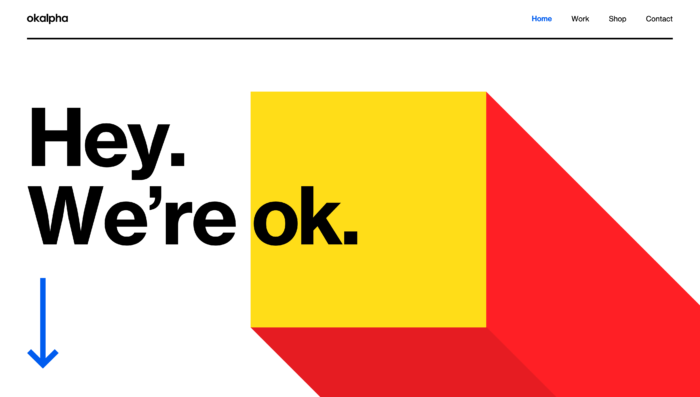
A motion design studio based in Cape Town, okalpha has both a stunning body of work and an amazing site. I suggest that you spend a good amount of time with both.
Break Maiden
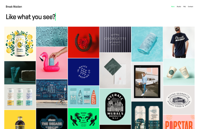
Purveyors of that current style of branding rooted in the vernacular of pseudo-naive Americana, the folks at Break Maiden are masters of the form. Even though I’ve moved away from brand design in my daily practice, I still have a lot of appreciation for the people that do it well. Check out all the work for some stellar examples.
No Comments.