August 25, 2022

Summer Ephemera // Inspiration

I tend to keep my eyes open for interesting finds that inspire me in some way when I'm traveling. I'm never looking for material for a specific project, just for visuals that strike a chord. Here are a few of my favorites from a recent trip to the White Mountains region in New Hampshire.

February 21, 2019

Monthly Fascination: February ’19

It's been a long winter. I've had some personal stuff going on, and life has been pretty full with things that aren't necessarily writing. As a result, I've let the posts slip on this site. This is fine in the grand scheme of things, but I do think that doing this thing is a helpful muscle for me to keep flexing. They're a reminder to think about design and creativity outside the constraints of my day-to-day life. With that in mind, I'm back at it.

A couple of other updates: I published the post that I had started but didn't finish back in October of 2018. Here it is if you're interested. I also finally let go of a few things, worked through some logistics, and got my newsletter going. It'll probably be a month endeavor, similar to this, but focused on a wide lens than design. If that's your thing, there's a sign-up form here.

CENTRE FOR VISIBILITY DESIGN

With the dramatic disruption happening in the device space, the topic of type legibility seems to come up every few years. Up to this point, practitioners have relied on anecdotal evidence or best practices when designing for legibility. The Centre Visibility Design has taken on the task of researching what actually makes type more readable. At least, we have some real evidence.

okalpha

A motion design studio based in Cape Town, okalpha has both a stunning body of work and an amazing site. I suggest that you spend a good amount of time with both.

Break Maiden

Purveyors of that current style of branding rooted in the vernacular of pseudo-naive Americana, the folks at Break Maiden are masters of the form. Even though I’ve moved away from brand design in my daily practice, I still have a lot of appreciation for the people that do it well. Check out all the work for some stellar examples.

February 18, 2019

Monthly Fascination: October ’18

(I had this saved to my drafts folder, but never actually published it. Here it is, better way late than never. I've got another post queued up for February links that I'll post later this week. I'm not going to edit it, but I didn't end up getting the newsletter together for this post, which is why I delayed it. I've got it going now, and will be sending out the first issue this week as well.)

A couple quick items of house-keeping before we jump straight into it: the first thing is that this is the first month that a post in the Monthly Fascination series will be accompanied by an issue of my all new newsletter. Christened "Frequent Fascination" to tie it into this series, as well as lean into my love of alliteration, it will consist of a list mix of content from this post as well as a few other things that other may find interesting. It's the first time that I've tried to do something like this and I'm interested to see how it goes. If you're interested, you can sign up here. Secondly, I'd love to hear some feedback on these posts. Are they worth while? Does the format work? Should they be more…or less? Whatever you think, drop me a line.

The three links that really caught my attention this week all coincidentally had to do with the idea of created space. Two relate to created space that we build around ourselves, and the last with the identity that we build around that space.

Brand Design for Pedro Salmerón, Architect by Buenaventura

I was really drawn the simplicity and flexibility of this system for the architect Pedro Salmerón. Speaking from experience, it's such a challenge to create identities for creative practitioners of any sort. Consisting of basic rectangles and 45 degree slashes to structure space, with subdued textures and a very neutral palette to round everything out. The designers at Buenaventura did an excellent job creating something interesting that also lets the architect's work take center stage.

A Map of Every Building in America by the NY Times

A fascinating project. Maps that don't answer questions, but instead suggest them. The thing that really sticks out to me is the interplay between humans trying to structure the environment and also being structured by it at the same time.

An Algorithmically-Derived Personal National Flag

With our global culture increasingly dominated by nationalistic fascists, the discussion of what ties out together as country(wo)men has never been more important. What if we didn't pledge unwavering allegiance to symbols that come laden with centuries of burden? A project by the Puerto Rican design firm Muuaaa suggests that maybe we should find strength in our own beliefs and symbolism. Leaning on a system that generates flags from a subset of an individual's choosing, the studio created a way for people to walk away with their own national identity.


That's it for this month. I hope that you found some of these tidbits stimulating, or at least interesting. Let me know either way, and thanks for your time.

July 10, 2018

Monthly Fascination: June ’18

My monthly round-up of interesting design that I've come across in the past month. If you missed the May post, it's right here.

Prospectus Typeface

Last month, the Lost Type Co-op released a really interesting serif face titled Prospectus. If you just look at the heavy weight, it looks like another take on the high-contrast serif faces that have become quite fashionable of late. I'd encourage you to look at the full set of weights and styles, especially the lighter weights an italic styles. It's a really unique face, with a very nice microsite art directed by Riley Cran.

The Guardian: Consumerism vs. Materialism

"If we want to cure affluenza, we have to get more satisfaction from the things we already own, more satisfaction from services, more satisfaction from leisure time, and less satisfaction from the process of buying new things."

While not explicitly about design, it's hard not to think about the implications of our consumer lifestyles without considering the part that design has to play. I'm just as guilty of purchasing things for that immediate rush, but I've really become frustrated lately how expensive or just difficult impossible it is to repair so many of the electronics that I've acquired over the years. At the very least, it's a reminder to appreciate the things that we have.

A Shift in the Design for Politics

As much as our current political climate feels like a dumpster fire, it's nice to see that some progressives are embracing modern branding as a tactic to engage with a younger voting populace. The recent success of NY Congressional candidate Alexandria Ocasio-Cortez has been really inspiring to watch, and I hope it signals a change in our national political discourse. In addition to the work for Ocasio-Cortez, the campaign of Suraj Patel also caught my eye.

I hope you found some of this inspiring, and check back new month for more.

June 10, 2018

Monthly Fascination: May ’18

I thought I'd try a series collecting some things that I found interesting in the previous month. They might be design, art, articles, words…whatever causes me to pause and dig deeper.

Robert Dawson's Library series

image © Robert Dawson

I've always loved libraries, and have since childhood had access to really great libraries and librarians. Dawson's Public Library photo series really captures the huge variety of libraries across America. Each one a reflect of the place where it resides and its history.

Phil Patton Lecture with Natasha Jen and Khoi Vinh

An excellent discourse by masters of the design field. I tend to side more with Vinh on the topic, but excellent points are made by each side. In all, a very relevant topic for the field of design as a whole.

The Art of Akira

When I stumbled onto Akira sometime in the early '90s, it blew my world completely open. It was such a transformative piece of art and an absolute marvel of the medium. The Art of Akira reveals of of the process work that went into creating it. Hat tip to Ricky Bloxsom for the link.

January 29, 2018

About Ursula

I've been thinking about the death of Ursula K. Le Guin and her affect on me. I discovered her books—specifically The Wizard of Earthsea—at a relatively young age. What age exactly I don’t quite recall, but certainly in that formative period of between 10 and 12 years old. While at the time I didn't really have any knowledge of Le Guin's work, the book resonated with me a way that few did from that period of life. After I had finished the book, I strongly call a feeling of, this is good, this is different.

What I loved about The Wizard of Earthsea was its humanity. Ged, the protagonist of the first book in the series, is of very humble origins. Throughout the book he struggles with purpose and ambition, greed, selfishness, and ultimately a path to personal redemption. Far removed from typical mythological or fantastic tropes, he follows a winding path that returns as often to internal conflict as it does external forces. In fact, all of the Earthsea books that I've read don't have a typical MacGuffin like so many fantasy and science fiction books. Instead Le Guin uses the tool of fantasy to focus in on the human condition, as all of the best genre writers have done before and since.

After finishing The Wizard of Earthsea, I moved on to other authors. I don't recall why, whether it was ignorance of other books in the series or even if I had not thought to see what else Le Guin might have written. Three or four years ago, however, I picked the book up again and read it absolutely enthralled. It seemed like an entirely different book; one with so much more depth and subtlety than I recalled. After finishing it, I move on to the second and third books in the series. Each was different but fascinating in its own way.

In reading some other's impressions of Le Guin's writing over the past week, I'm realizing the tremendous impact that she had by being an incredibly outspoken champion of female voices in genre fiction. She also wrote nuanced stories that centered around non-white characters and stories that explored gender. I wish that I could say that her writings had impacted me in that way. In truth, I haven't read the books where those issues are central themes but I'm looking forward to doing so. Regardless, it speaks to the myriad ways in which Le Guin challenged assumptions and spoke out for under-represented groups.

The world is certainly a less magical place, having lost the voice of Ursula K. Le Guin. Now is one of the times when we could most use her. With any luck, the people that have been influenced by her will rise to the challenge of shaping this world into a greater place in ways that we can't imagine.

Note

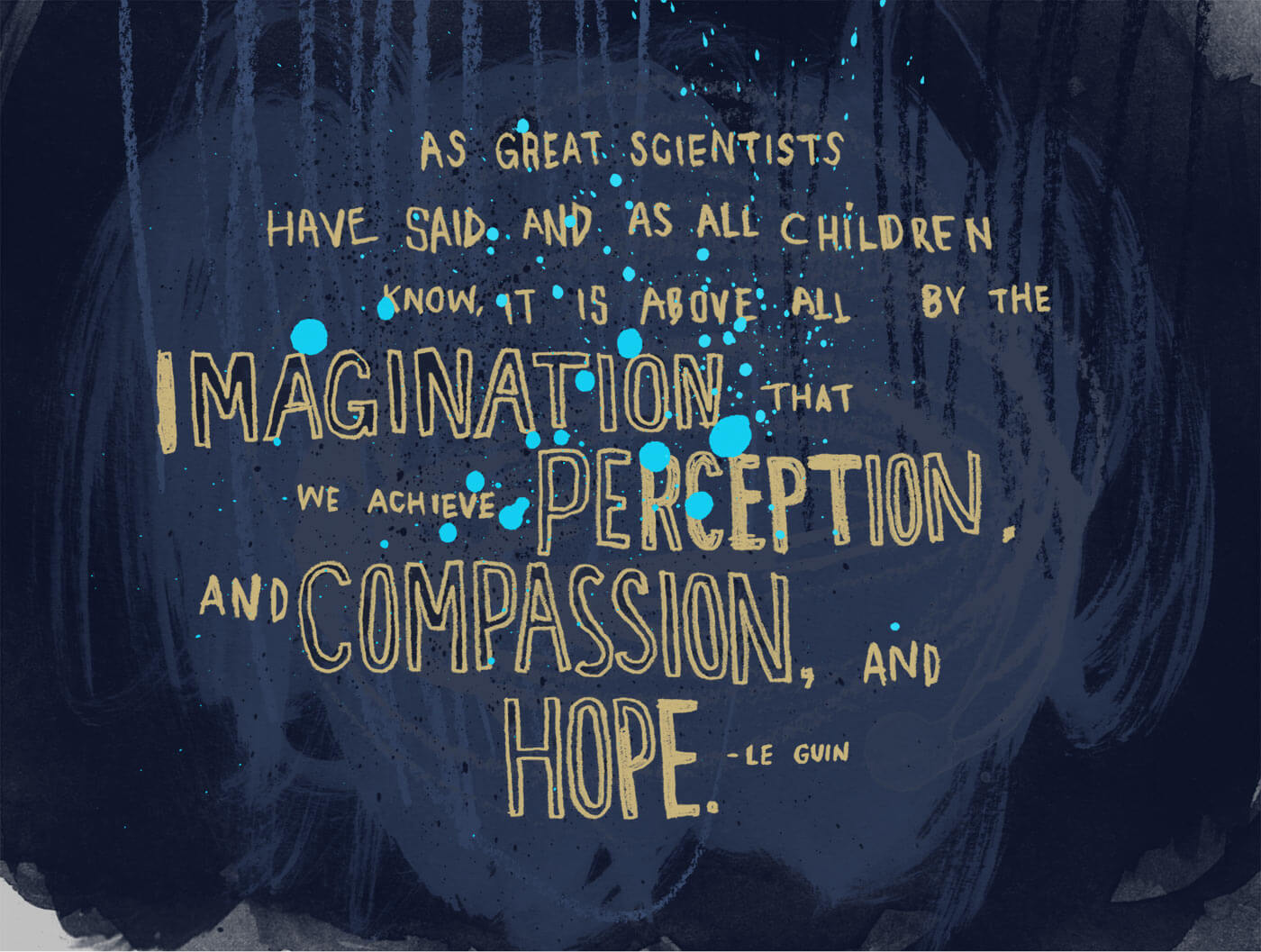
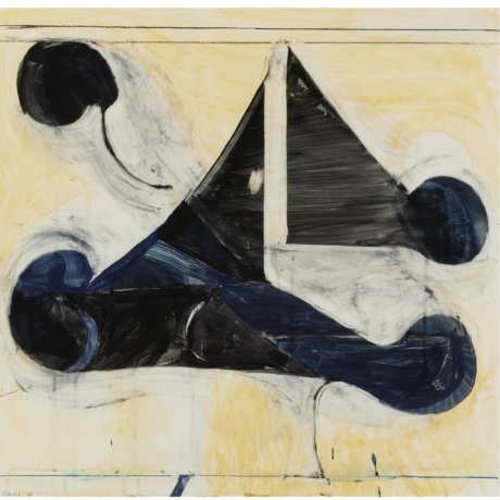
I created the image at the top of this post for my New Years card last year. It's one of my favorite lines from Le Guin, and remains extremely relevant and poignant. If I learned nothing else from Ursula K. Le Guin, it's how to imagine ways in which things might be different from how they are now. If you've made it this far, I hope you'll also do the same.

December 28, 2016

Inspiration: Zach Lieberman

I took a dive into Processing this year. It started with going through Josh Davis's intro class on Skillshare, and then moved on to Dan Shiffman's intro book. While the dive was fairly shallow, I really liked getting into it and I'm hoping to get back to it sometime soon.

Last week I discovered the work of Zach Lieberman via Instagram's discovery feature. He has been spending the last year doing daily sketches using a variety of generative art tools. Tools aside, I particularly like that his work has more of an organic quality than much of the generative art that you see around. Indeed, that's one of the qualities that I most hope to be able to create with my own explorations. While I'm certainly not there yet, I really encourage you to check out Zach's work. Of particular interest is the (lengthy) article that he recently published which talks about the process behind some of his daily sketches. It's an interesting look into the process of creating digital art.

Header image is two of Lieberman's daily sketches.

September 5, 2016

Inspiration: Richard Diebenkorn

I've been looking at the work of Richard Diebenkorn a lot recently. With his unique structuring of space and sun-seeped color palettes, I'm drawn deeply into his world of abstraction. The work resonates deeply with both the work that I do professionally as well as my more artistic practice.

Richard Diebenkorn - Berkeley No. 3

Richard Diebenkorn - Berkely No. 3

Richard Diebenkorn - Albuquerque No. 4

Richard Diebenkorn - Albuquerque No. 4

It's difficult to describe the compositions as anything other than artfully balanced. Dramatic in their asymmetry, pieces often strongly emphasize the right or left of the picture plane while calling attention to the verticality of his preferred format. Although many interpret his work as an abstraction of California landscapes, Diebenkorn disliked the association. For him the work is purely abstract and not grounded in a metaphor of the physical world. Each piece is problem to be explored and unraveled through regular practice. I can relate to the tension and challenges that he alludes to in the video below when trying to figure out a particular painting:

When it comes to color, Diebenkorn was an absolute master. Though difficult to perceive in reproductions, each shape is made up of layer upon layer of translucent color. The resulting tones echo the light of the southern California sun, and have a certain dirty radiance that I'm continually in awe of.

Richard Diebenkorn - Ocean Park No. 125

Richard Diebenkorn - Ocean Park No. 125

Richard Diebenkorn - Untitled No. 18

Richard Diebenkorn - Untitled No. 18